

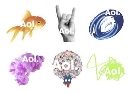
After their recent split with Time-Warner AOL today launched their new branding.
It can be seen here at:
http://www.aol.com/
First impressions... what the hell is that stupid bar at the top of the page! bit lame. Then I realised that it changes the header banner background to represent Aol sub-divisions (Aol.) Music, um Rock and Roll and er Aol.Goldfish! Seems like this was rather rushed and really doesn't communicate any kind of message. To me it says mess.
They have attempted (poorly) to integrate an editable interface where you can drop your own links into the side bar which is a good step. But it's half empty as thats about all the user can interact with the layout of the page! What's the point in teasing an audience with something they can do better. Aol should take a note out of the BBCs book. Aol have missed a huge opportunity with this.
Aol really needed to think outside of the Goldfish Bowl and not try and produce a rubbish version of what already exists!
Aol.ouch!

No comments:
Post a Comment